 by K.T. Weaver, SkyVision Solutions, Updated October 2018
When you want to promote the safety of a product, it is common to use a chart in an attempt to put in perspective the safety of “your” product in comparison with other products. Unfortunately, you are sometimes forced to compare “apples with oranges” in these endeavors, and depending on your level of bias, two different organizations can arrive at totally different charts using basically the same data.
The chart shown below is one taken from a PowerPoint slide presentation prepared by Itron (a major manufacturer of smart meters) for a workshop held on September 20, 2012, with the Florida Public Service Commission. The workshop was entitled, “Smart Metering Technology Overview.”
The chart compares radiofrequency power level densities for “common devices.” The primary source for the information in the chart is given as a case study for one model of smart meter conducted by the Electric Power Research Institute (EPRI).

What does the chart show? Initially taking the chart at face value:
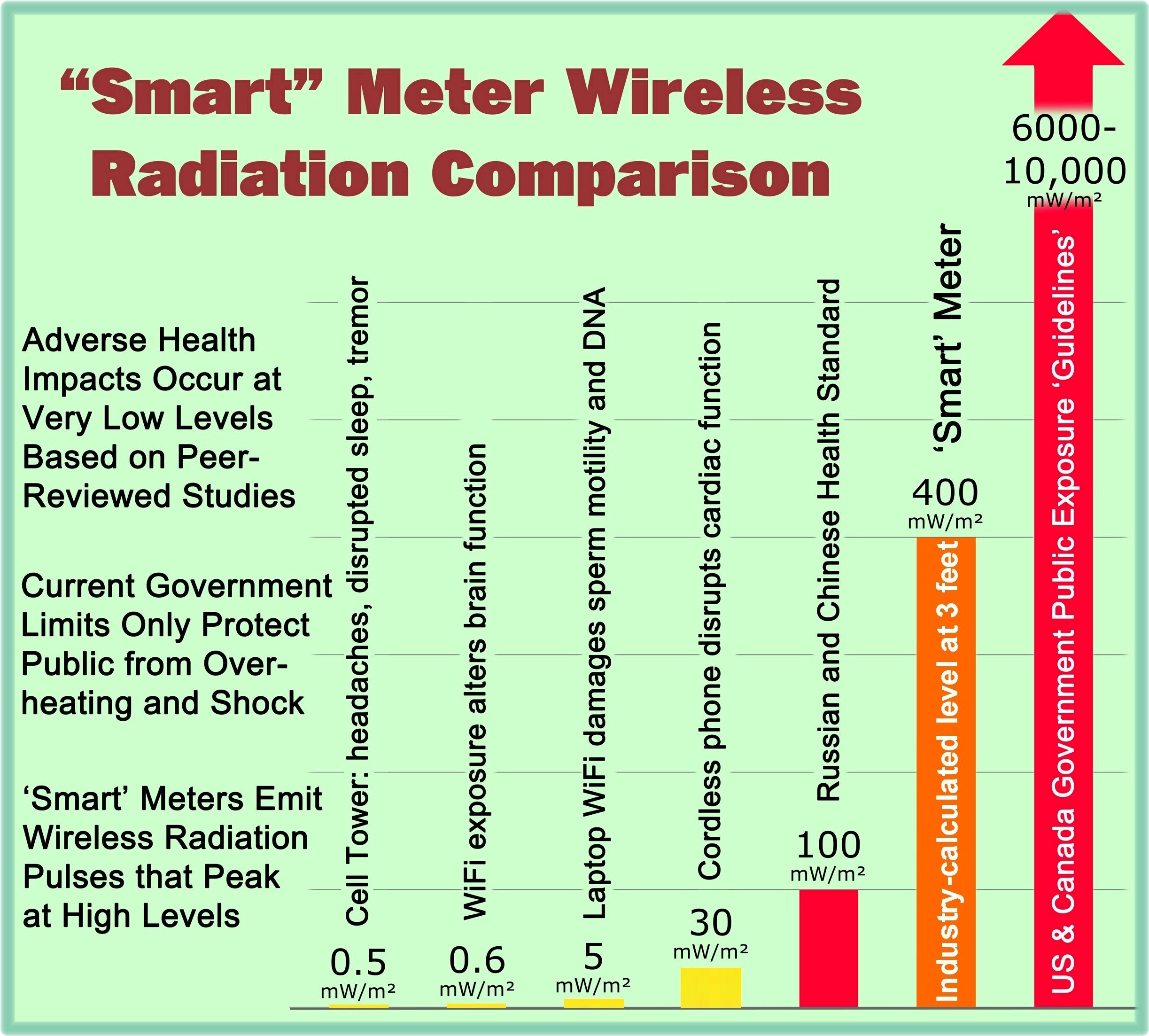
- Cell phone radiation emissions are much greater than for other wireless devices.
- Smart meter radiation exposures are somewhat less than the exposure from a microwave oven.
- Smart meter exposures are higher than for Wi-Fi routers and FM/TV broadcasts.
Varying levels of criticism can be offered for this chart. Although the above chart is definitely biased in trying to present a comparison of RF emissions for various devices, there are other charts that are even more biased than this one. In some other charts, data will be graphed in a way that shows instantaneous peak values for all sources except the smart meters. For smart meters, an average power density is then shown on the graph, based upon an assumed duty cycle (the percentage of time a meter transmits a signal), making the smart meter value look unreasonably low by comparison. The above chart, to its credit, at least avoids the controversial issue of duty cycles and compares all devices based upon instantaneous or peak power densities.
On the other hand, one obvious problem with the above chart is the description that the smart meter radiation levels are as “far less than standing next to your microwave.” This is not an accurate characterization of the actual numbers on the chart. Look at the distances. If the smart meter radiation levels had been reported for a 2-foot distance, as the microwave, there may have been little difference at all between the two devices. And who actually stands next to their microwave when warming up a dinner, etc., for the entire period of use? The above chart shows the smart meter radiation levels at 3 feet and 10 feet. Why not show the microwave levels at the same distances?
In fact, I was able to confirm by extrapolating EPRI smart meter data for 3 feet and 10 feet, that the radiation level for a smart meter at a distance of 2 feet would be 200 microwatts per cm2, the same value as given by EPRI for the upper level exposure for a microwave at a 2-foot distance. But not only that, the collective evidence from three separate (non-EPRI but yet industry-related) references would substantiate that a radiation level of 10 microwatts per cm2 could be listed for a microwave oven measured at 3 feet. Then we would have the smart meter listed with a higher radiation level than the microwave oven at 3 feet. … Of course we couldn’t have that! … Here are the references:
- Richard Tell Associates performed measurements on two (2) separate microwaves during a study in the state of Vermont. The test results were almost identical at a distance of 3 feet, indicating a power density of 10 microwatts per cm2. [Reference: “An Evaluation of Radio Frequency Fields Produced by Smart Meters Deployed in Vermont,” by Richard Tell Associates, Inc., dated, January 14, 2013. ]
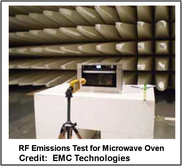
 EMC Technologies also performed measurements for a microwave that showed a results of 6.1 microwatts per cm2 at one (1) meter. [Reference: “AMI Meter Electromagnetic Field Survey,” EMC Technologies, Final Report, October 20, 2011.]
- Richard Tell Associates in a document entitled, “Summary Discussion of RF Fields and the PG&E SmartMeter System (2005 Report and 2008 Supplement),” quotes a value for a “Typical RF field in kitchen with operating microwave [1 meter]” as 10 microwatts per cm2.
What needs to be also acknowledged, however, is that a chart as shown above omits much of the crucial information from the original EPRI source document. The full document name was: EPRI Document # 1022270, “Radio-Frequency Exposure Levels from Smart Meters: A Case Study of One Model,” February 2011. The RF source information consisted of a table (not a chart) of various RF sources with several columns. It was never appropriate to graph the information from the EPRI table because you cannot do so with omitting much of the qualifying information. The table below is a close facsimile of the original EPRI table.
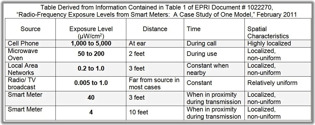 As you can see, a simple chart or graph cannot properly portray that the cell phone exposure is limited to the duration of a phone call or that the cell phone exposure is characterized as “highly localized,” while exposure to a smart meter can potentially become a source of chronic exposure to a larger portion of the whole body, i.e., for several hours per day, every day. Likewise a chart containing EPRI’s reported microwave exposure level values from 50 to 200 microwatts per cm2 cannot visibly convey the information that its exposure potential is limited to “during use,” at distance of two feet, for however long a person might actually stand at that distance from the microwave.
An additional point to be made for the EPRI data in the original table is that it characterizes typical cell phone radiation levels for individuals as being in the range of 1,000 to 5,000 microwatts per cm2. To my knowledge, these numbers were calculated by EPRI using assumptions and rationale that have never been fully revealed for scrutiny. They are not measured values. Furthermore, I have come to a conclusion that the reported value of 5,000 may be unnecessarily high. 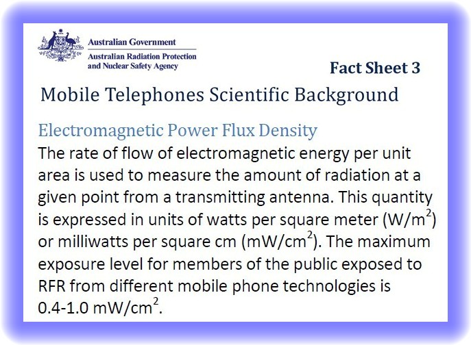 For example, the Australian government has published a fact sheet that indicates that “the maximum exposure to members of the public exposed to RFR from different mobile phone technologies is 0.4-1.0 mW/cm2.” This value range converts to 400 to 1,000 microwatts per cm2. I mention this because it is usually the EPRI calculated value of 5,000, when used by various organizations to create their own “fact sheets,” that seems to make it look so lopsided in terms of cell phone exposure being substantially greater compared to exposures from other sources. For the chart above, look at how much different it would appear if the cell phone exposures were plotted to range only from 400 to 1000 microwatts per cm2.
In addition, if you study the technical aspects of power output for cell phones, you’ll find that all hand-held cell phones in use today utilize “adaptive power control,” which means they transmit with the lowest possible power to allow communication with the nearest base station. Smart meter advocates never tell you this! Although adaptive power control has the effect of lowering RF exposure, it was primarily developed in order to conserve battery power as well as reducing interference problems that would otherwise occur if all phones were transmitting at maximum power all the time. Based upon the information reviewed, it is safe to say that the typical cell phone call will typically result in radiation levels significantly less than 1000 microwatts/cm2 to the head area.
As a further follow-up, refer to a 2015 article at this website, “A Critical Review of the ComEd Radiofrequency ‘Fact Sheet’,” that establishes how the cell phone power density value could have been plotted as low as 20 microwatts per cm2 instead of 1000 to 5000 microwatts per cm2. Link to article:
https://smartgridawareness.org/2015/06/11/review-of-comed-radiofrequency-fact-sheet/
In summary, with a straightforward and impartial review, the broad assertion made in the above colorful chart that “RF emitted by smart meters is significantly below the levels produced by other common household devices,” is just not supported by the evidence. In fact, it was inappropriate to even create the chart in the first place since it leaves out important qualifying information from the original EPRI table. The qualifying information in the EPRI table dealing with distance, time, and spatial characteristics is essential for proper interpretation of the data.
Here is another important note. Because of the focus on colored charts and graphs on the subject of smart meter emissions comparison with other wireless devices, people don’t have a chance to read the actual accompanying words written in the source document, namely EPRI Document # 1022270. In the conclusion section of that EPRI document it states the following: “The average exposure levels from smart meters, as measured in the current study, are at levels similar to those that are present from other common RF sources, both indoor and outdoor.” So although there may be some inaccuracies in the original source document table that has spawned a number of other comparison charts, the EPRI document did not overtly attempt to over-exaggerate the differences between smart meters and other devices. … But other smart grid advocates certainly have done so.
Finally, for those of us who oppose the installation of wireless smart meters, there is also an element of principle involved. Exposures to RF emissions from cell phones, microwave ovens, and Wi-Fi routers in our homes can be voluntary experiences while the smart meter exposures are not. A person can eliminate or curtail the use of the other common devices in the home, but in most cases across the country, for the wireless smart meter, a person cannot. If there is an “opt-out” provision, a fee is usually involved in order for a person to prudently avoid a newly added source of RF emissions for the home. From a principled standpoint, those who oppose smart meter installations do so on the grounds that people should not have to pay penalty fees in order to avoid the various risks associated with such meters which not only include RF radiation but also privacy and data security risks as well.


Interesting how a good effort to correct the presentation still results in a very weak case for smart meters being of any significant concern, except perhaps in the most extreme situation in which one has a habit of holding it up to one’s ear. Your conclusion is a non sequitur unless you actually want to apply the standard of voluntary exposure, in which case i can only imagine the number of things that would need to be shut down far beyond smart meters, including all the sources of natural background radiation since that is quickly above that of smart meters at distance.
Website moderator: This article was originally written in 2013. No efforts were made to “correct the presentation” per se although the blog article itself tried to provide perspective on the biased chart used at a Florida Public Service Commission workshop in 2012. As time passed, some effort was made to update information in this blog article although better and probably more relevant information was also later added in other website articles and pages such as at https://smartgridawareness.org/rf-health-effects/rpd-comparison-values/
Are the smart meter measurements taken 3 to 10 feet out front of the smart meter, or behind it through the wall and other household clutter?
For this particular article, the measurements would represent values in front of a smart meter. Remember in some cases, particularly older homes, utility meters may be located inside of the home. A rule of thumb is that values are attenuated by about a factor of 10 by passing through a wall.
For more detailed information on possible smart meter mounting configurations and indoor versus outdoor measurements, please refer to the following link: https://smartgridawareness.org/rf-health-effects/comparison-values/. Also note possible reporting of RF values in different units, sometimes µwatts/cm2 and sometimes mW/m2.
So you are complaining about omitting information at fail to mention this major fact in your analysis? The vast majority of meters are outside and the ones that are inside are generally in a basement or non-living space. Also the back of the meters face the home typically and are enclosed in a metal, almost like a Faraday cage with the exposed part facing away form the home.
If you are going to call out people look at your own biases as well.
With a name like “Impartial Observer,” I doubt you are unbiased yourself as you surf around making comments at blogs. When evaluating an issue from a safety perspective, one does not normally just consider what would probably be true for the “majority” of meters or people. We cannot ignore the issue because only a few people might be affected. There are lots of possible configurations of how smart meters may affect residents. One (actual home) is discussed at https://smartgridawareness.org/2013/09/20/smart-meter-home/ as an example.
Great new site! Thank you for putting this together – it is definitely needed.
Here’s one professor’s view of the comparison of radiofrequency radiation emissions. Hope it is helpful to you: http://www.committeetobridgethegap.org/pdf/110212_RFrad_comments.pdf.
Mr. Hirsch makes a number of great points in his analysis of the CCST report. Particularly his analysis is a good one which accounts for the fact that people don’t use their cell phones or microwave ovens continuously (24/7). In Figures 3 and 4, Mr. Hirsch attempts to address the fact that reported cell phone exposure values are limited to the ear while smart meter exposures are somewhat more uniform in nature to the whole body (which obviously has a greater surface area). Technically however, Mr. Hirsch makes some assumptions in developing Figures 3 and 4 that are not easily supported with a good technical basis. In addition, Mr Hirsch in his document even states that “It should be stressed that neither this estimate [Figure 3] nor that in Figure 4 using a different approach is intended to be a definitive figure,…”